I tried to summarize what seem to be a consistent UI for the whole machine
but this post is intended to evolve (or even be completely modified) depending on the corrections/suggestions that could be brought to me by other users
so go ahead! Let’s make the pyramid UI perfectly smooth and coherent for us all ![]()
LIVE MODE
use a def file for all chords and scales on the machine
STEP MODE
we still need a way to visualize the BAR currently being played!
for now, the “page” tracking is not so useful… (not a “musical value”)
as soon we are no longer in 4/4 TS it doesn’t work anymore
same thing with the visual indicator of the BPM
why choosing a graphic with 4 beats?
if we have a track with a 3/4 TS it doesn’t work anymore
the BPM indicator is wrong in this case.
it seems that the Pyramid (with its current architecture) doesn’t know what a “first beat” is
and this issue leads to some other problems like several bars on the same page (with TS other than 4/4)
with for example the first beat of the next bar which can be find on the 14th or 15th step for example..
instead to be on the beginning of the next page
this could be much (much) clearer
CHORD DISP
please! a REAL chord mode display ![]()
(not a duplicate of the PianoRoll)
PIANO ROLL DISP
muted notes are indicated on the pads, they should be indicated also on the Piano Roll (with “gray” notes for example)
we have too much space between the notes B and C and E and F
(just semitones between these notes…so it’s not proportional with the other semitone intervals in this display) we could save some precious pixels in height here…
when a group of notes is selected (mono edition) the selected area doesn’t indicate the “notes” actually, but an “area”
because the selection doesn’t take into account the length of the notes
each selected notes should be indicated individually
the same problem in the CC automation display causes an issue,
because the indicated area is not always exactly the part of the curve which gonna be actually edited
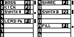
PATTERN MODE
copy/paste function
(pop-up screen with two options:)
merge or replace?
DISP
a screen summarizing the patterns available on the current track
with TS, run modes, and length
2ND+PATTERN (STEP+TRACK)
all the options concerning patterns :
- Run mode
- PC/MSB/LSB
TRACK MODE
copy/paste function
(pop-up screen with three options:)
track settings (name, channel) or track content (patterns) or both ?
DISP
1rst: a screen with all the track names (16 per page) and the active pattern on each of them
it would be nice if this screen could appear as soon as we hold the TRACK key, to visualize momentarily the track names and active patterns from any other mode
2nd: the current track DISP (progress bars)
3rd: all the different TS and length (we lost this screen since 2.0)
2ND+TRACK
all the options concerning tracks :
- names
- call (instrument and note definitions)
- cons
- PTRN
- TRSP
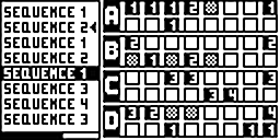
SEQ MODE
copy/paste function (and “delete”… like on all other modes)
(pop-up screen with two options:)
mute/unmute states or active patterns?
DISP
list of sequence names on the left (instead of 5 track names)
up to 8 names per page
playback order (with a visual indicator for the sequence currently be played)
and possibility to interact directly on this list : go through the list with the main encoder and compare the different track states thanks to the right side of the screen
(click on the encoder to: play from, move, delete…just like on the main screen)
and on the right side of the screen,
instead of tracks numbers (which are redundant considering the disposition of the 16 pads just like they are on the Pyramid panel, and with bank letter indications)
this screen part could indicate directly the numbers of the active patterns
2ND+SEQ
ability to name sequences
2ND SAVE/LOAD SCREEN
a better file management
delete, overwriting…
reorder projects by names, dates…
folders…
all modes
possibility to quickly move and re-order patterns, tracks and sequences with left/right arrows
(just like we can move steps horizontally)

 )
) I use pyramid always the same way and I am a bit blind.