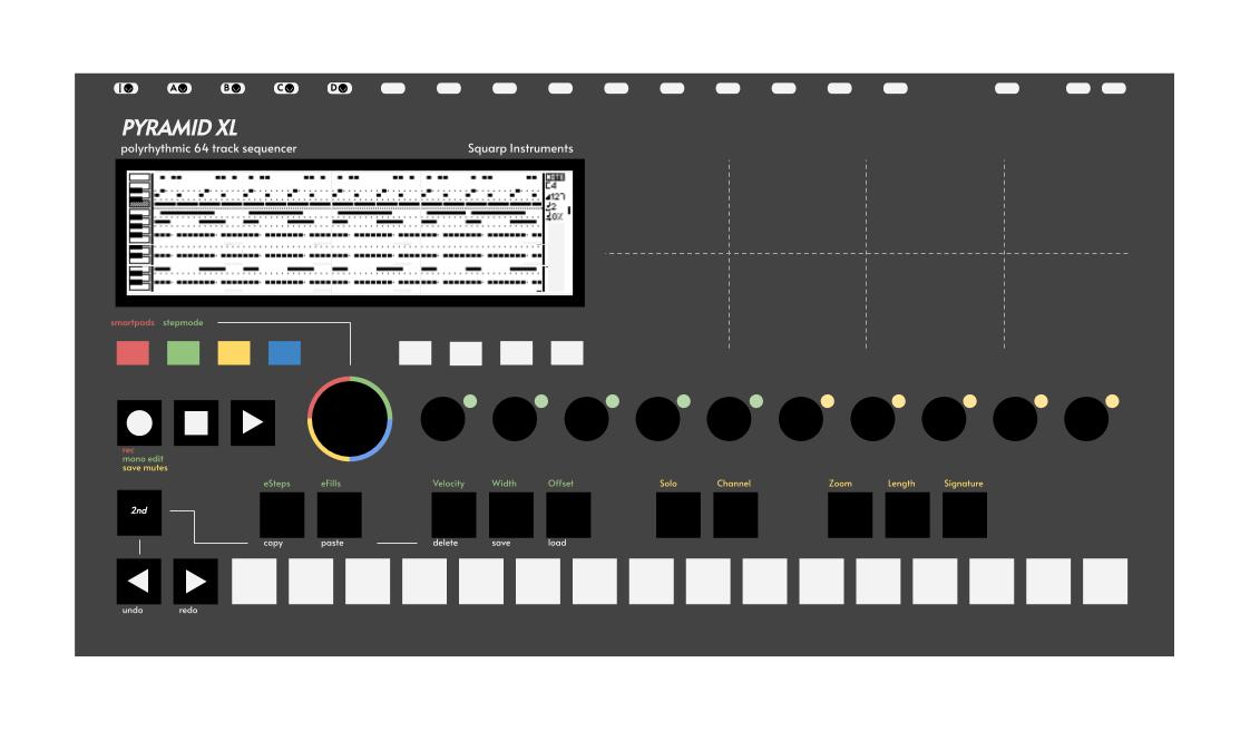
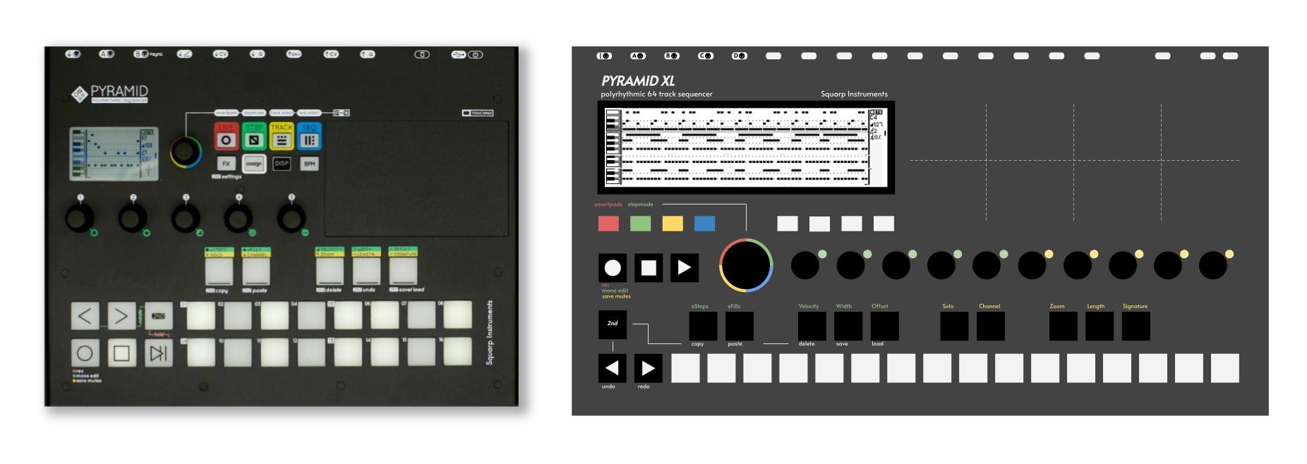
I’m loving the Pyramid so far, however I find it a bit cramped sometimes when wanting to edit polyphonic steps, and I’m still getting used to the button combos. I think increasing the screen size and having the 16 steps in one row might go a long way in making it a tad more user friendly. I made a mockup of a sort of XL version of the Pyramid. Honestly, all it gives you is a bit more Pyramid without changing the core design too much. It adds a wider screen, wider touchpad, single row for steps and for an expanded 2-octave keyboard, more MIDI I/O, potentially more CV I/O etc, double the assignable encoders.
Suggestion: IMO Play and Stop buttons need to be somewhere less…‘busy’…to access. The lower left corner (as the current models are) is great in case you are in a dark or poorly lit space with the adrenaline of performance rushing through your skull and in your excitement you need to push a button while ‘in wacky perfomer character’.
ie - it needs to be in a place that you won’t accidentally hit that encoder.
Just a suggestion.
That’d be a thing I’d worry about because when I perform I get a bit…excited (read: sloppy). LOL
I like two rows… which are the smart pads? how can you distinguish them from the other pads?.. on the actual device this is illustrated by the fact they are on the bottom.
Interesting mockup… But I dig the size of the pyramid because a one octave keyboard could easily fit on a small desk along side it.
yeah, all of which could be done with a little basic woodworking… Works fine without it… But it would be slightly prettier and more personal if I could make something that accentuated the pyramids beauty.
Nice idea. Though, I personally hardly use the X/Y pad so making it even bigger seems like a lot of space for something which isn’t as essential as other interface elements. Personally, I’d rather have an even wider screen (or 2 screens)
Really? It’s a lot of fun… I think it’s probably the most intelligently implemented XY pad I’ve ever used… can’t wait to map it to cutoff and res on a filter.