Yep it does. I find that weird and unhelpful and I’ve yet to see any real reason why that exists. I’m not going to scroll the whole canvas to align the bottom row with a possible correct note to see if it’s the right one or not.
my personal opinion is this is the main ‘issue’.
I think depending on what you are doing, different navigation methods are necessary, and they are actually consistent, so you can get used to them.
but the issue I find, is as soon as you start scrolling by page or single rows, you can quickly lose context.
example: use chromatic mode, and turn enc1 a bit (without looking), now tell me what note row 4 is?
the only way of knowing is:
a) have a note there, and know your colours.
b) press and hold a note
c) look at left display for base note, and count 4 semis up.
none, of these are very intuitive…
even worst, if you have recorded a bunch of chords, its very hard to determine on the left oled what they are, since not only can you not read the root note accurately, but you cannot also determine the intervals.
so, its not that the navigation is wrong… I really dont think any change to that would help at all…
its the fact, what after you change your space, it’s unclear where you are now.
I personally, would even be happy to sacrifice some of the left oled ‘overview’ capabilities, to be a bit more zoomed in to what are represented on the pads…
personally, Id like the left oled to clearly show the window the pads are representing, and have a keyboard/scale on it… so a quick glance, you can see where you are.
at the moment, it feels like the left oled is a bit under utilised, whilst it gives a reasonable overview, once you start building out a track, it quickly just becomes a set of tiny dots on the screen… and you cannot really ‘focus’ it in on what you’re doing.
in many ways this would be quite similar to the ‘drum view’, which I find a lot clearer.
(but of course, thats because the drum view is fixed to 8 lanes … so doesn’t really have the issue ;))
in fairness, I will say, I think the intention was that users would get used to the colours of notes… and so that would give good context, but honestly… I find, I only really remember a bunch of the colours - and I forget these after a couple of days of non-use. so thats not working well for me.
anyway, send your ideas to Squarp via the contact form, for me, it feels close… but some tweaks I think could improve it for everyone.
1 Like
Agreed, The nav is just minor issues and lack of consistency (e.g, why force to a page when in scale mode?) but as you say, the real issue is location awareness. I presume you mean “right oled” above, the one with the piano roll on it.
Another thought is to simulate the black/white keys of a keyboard using the leftmost column of pads with grey/white, or unlit/grey to represent keys, that way you’d instantly know where you are, at least within the octave.
1 Like
Oops , yeah meant right oled ![]()
My apologies for suggesting weird and unhelpful work arounds. I was under the mistaken impression you were finding it difficult to dial in specific notes or play them without skipping to the live view. Maybe because you said:
Hope a better solution is offered for you soon.
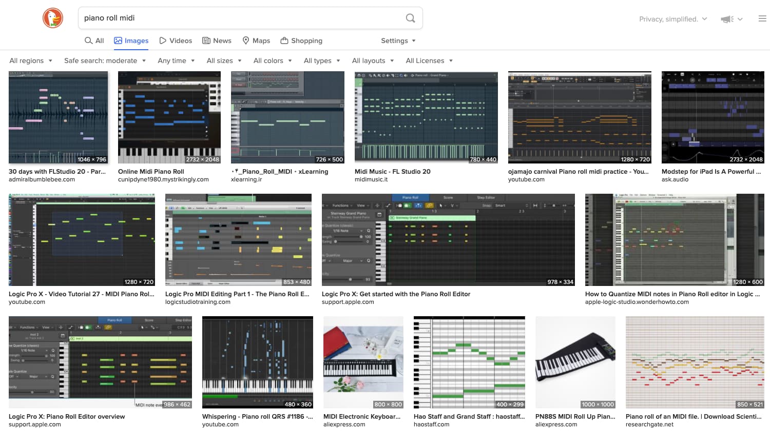
I really like the idea of there being a vertical piano keyboard on the left side of the right screen, like I’ve seen in numerous other “piano roll” MIDI editors. Right now, even though I can see the note that encoder 1 is set to, it doesn’t really help me make a mental connection between the colored pads, notes on the screen, and the actual pitches.
Just searching “piano roll midi” brought up a dozen images with a vertical piano keyboard on the left side of the screen, for example:
1 Like
yeah, I really like the way ableton does this with the use of fold and also scale, which really seem very applicable to something like the hapax (e.g. thing pScale)
normal piano scale, notice the shading
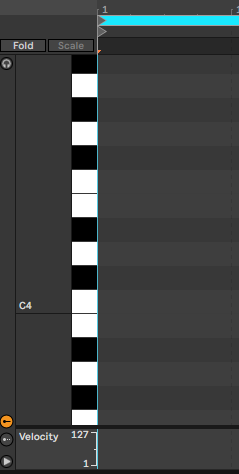
then fold (so only show notes used) , notice how adds note names, since you have lost ‘context’
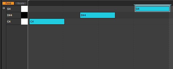
then we add a scale… we now have shading to indicate notes in scale (but we are NOT fixed to a scale)
finally, activate scale, and it now filters by in-scale notes. (again note: note names)
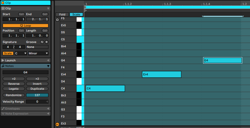
(you can also do fold+scale, but thats kinda redundant)
obviously we do not have colour, and the contrast is not massive on the screens.
but I do think, these kind of features really help navigation…
I think key points for me on these are:
a) context with keyboard , and note names when keyboard is not enough.
b) a quick way to switch between scale / non-scale view (*)
c) a quick way to fold/unfold
d) some kind of ‘banding’ on the display… so that you dont loose reference for notes across the other side of the screen … its quite a small screen, so this happens really easily , as the note bars are small.
as I say, the hardware is very different, so it cannot be the same as any of the daws piano rolls.
but I think it can be inspired by them.
(*) I really dont like being fixed in scales… but there is no doubt that, its useful as a way to edit notes… so I think a shortcut to move between scale/chromatic mode would be very useful.
and again, I think show ALL notes from all octaves and ALL bars on the right oled, is just really not practical given the size of the display… it needs to be a ‘window’ on track.
ok, it be nice to be able to zoom in/out… so you can see an overview, and for some tracks (often percussion tracks) then its ok, as they often are not that long, or using a wide octave range.
also if we zoomed in, then perhaps we could have some visual cues for things like notes with maths/rand on them . this is just not possible now, as the note bar are way too small.
I do think fundamentally this is the ‘issue’ here, if you try to use the right oled as an overview , of course, you are very limited to what you can display… as note height/length are just too small.
so if we back away from it being an overview - and more like the pyramid display - then I think many possibilities open up.
4 Likes
haven’t hooked up an external keyboard yet to test entering step notes that way but could there be a “Pyramode” setting for Step mode that basically turns the bottom row of the grid into a straight 16 pad interface, i.e., individual note assignments for the other 15 rows would be disabled and you can just assign notes for a given step 1-16 the way it’s done in Pyramid?
even just testing out programming a some 303-style patterns in Step mode, which typically span two full octaves for the note entries, scrolling up/down and then also keeping track which 1-16 step i need to enter felt a bit clunky my first few sessions. maybe it’ll become second nature with habit but the Pyramid way really was quite fast & easy for that type of programming, using an external keyboard to enter the notes.
1 Like
I did put a request in ages ago to have an ‘octave mode’ where each of the 8 rows would display whichever notes were in that octave, so you could see the whole pattern on the grid easily. They said it was a good idea, but didn’t commit to doing it.
Maybe suggest that as well as you’d imagine the more requests for a particular feature would mean it might get bumped up the list.
1 Like